Austrian State Prize: special branding prize goes to design by upart

Douro Boys wine group hired the Linz-based creative agency
Jorge Simao
Jorge Simao
Alexandra-Embacher-c-Martin-Guggenberger-Photography-web
30. October 2024 | 
Alexandra Embacher
30. October 2024
|
Alexandra Embacher

To celebrate its 20th anniversary, the Portuguese winegrowers’ group released two special wines, a red wine and a tawny port, which sold out within just 90 minutes when they were first presented in April 2023. Now comes the next success: the special “Branding” prize, which is awarded as part of the Austrian State Prize for “Smart Packaging 2024”, went to the Linz-based creative agency upart for the label design.

“20 Years Douro Boys Editions”

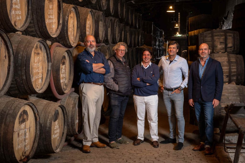
20 years, five wineries and two anniversary cuvées: the starting point for a new brand identity. The Portuguese winegrowers' group put the design brief for the “20 Years Douro Boys Editions” out to tender, which was won by the Linz-based creative agency upart. The job was anything but easy: “The biggest challenge was to unite five winemaker personalities on one label without neglecting the individuality of each one,” explains Daniel Frixeder, Managing Director of upart. Label design is a challenge for wineries anyway. It's not just about aesthetics, but above all about branding and unique positioning in a large and competitive market - and this is where the five wineries Quinta do Vallado, Quinta do Crasto, Niepoort, Quinta Vale D. Maria and Quinta Vale Meão should be “hit and miss”.

Design of the region

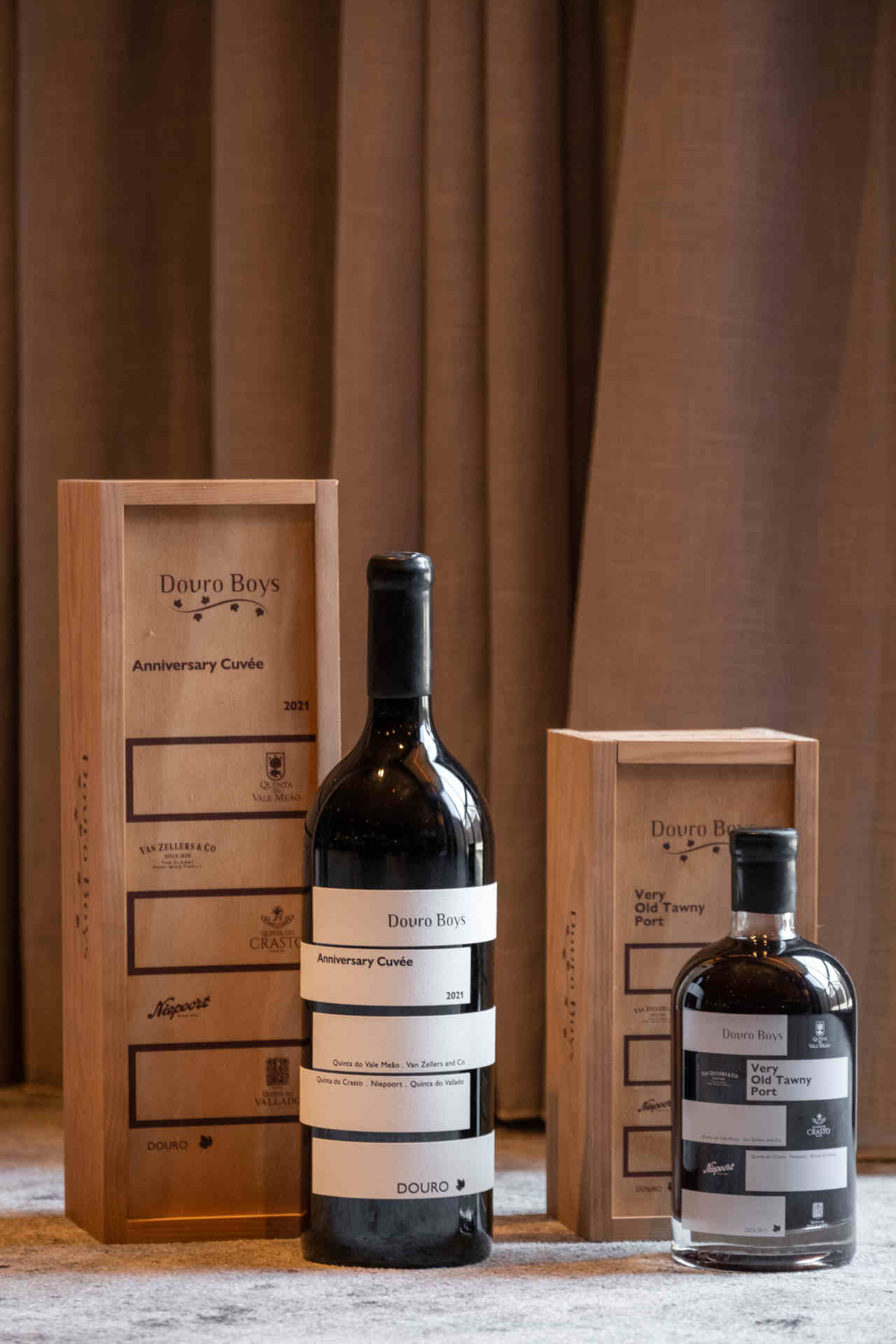
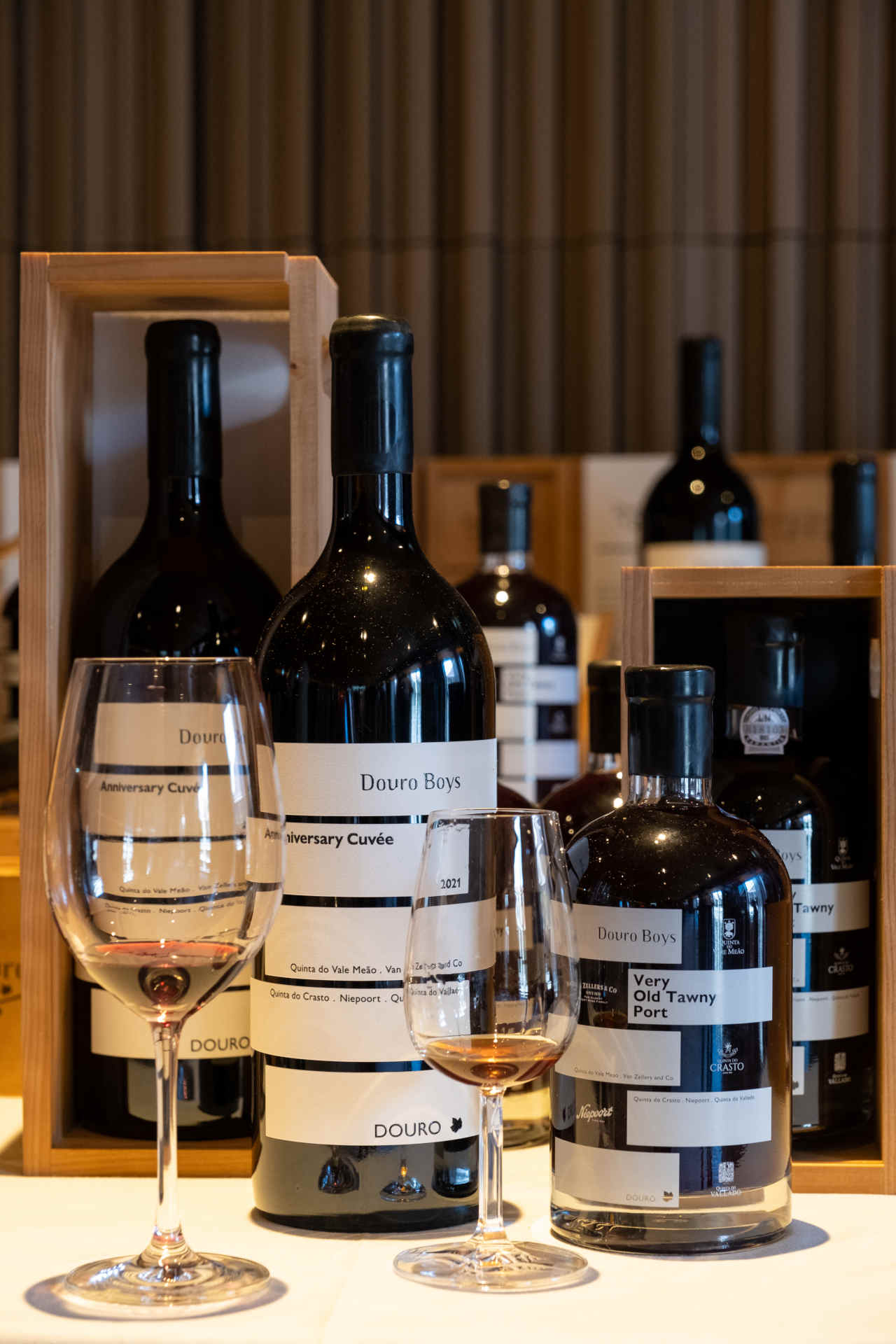
In the end, the decision was made to use a label that encircles the bottle, with five stripes, each representing one of the wineries, characterizing the appearance of the front. The recesses between the stripes are intended to symbolize the Douro River and underline the deep connection between the winegrowers and their region. Frixeder comments: “The result is a design that is not only visually striking, but also tells the story and the joint work of the Douro Boys for their region.” Paper labels were chosen for the Anniversary Cuvée 2021 red wine, while the label for the Anniversary Very Old Tawny Port was screen-printed directly onto the bottles. The wines are also stylishly packaged in specially designed wooden crates.

Austrian State Prize

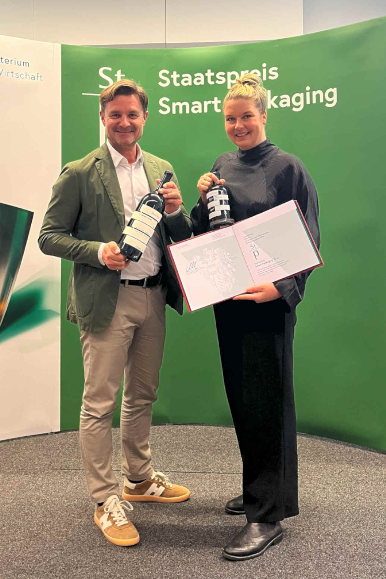
The sales figures show that the design of the edition was well received right from the start: 1.350 magnums of the red wine cuvée and 650 bottles of the tawny were sold all over the world within just 90 minutes during the first presentation of the wines in April 2023. The second coup took place recently: the design of the special wines was awarded the Austrian State Prize, special prize “Branding”. Awarded for the 61st time, the prize honors innovative and sustainable packaging solutions in Austria and is presented every two years by the Federal Ministry of Labor and Economic Affairs in cooperation with the Federal Ministry for Climate Protection, Environment, Energy, Mobility, Innovation and Technology.

Conclusion

The label design of the “20 Years Douro Boys Editions” by upart shows how creative design can fulfill both aesthetic and functional requirements. The characters of the five wineries were united by their connection to the region and the striking Douro River was incorporated into the design. The design is convincing - and has now been awarded the Austrian State Prize for “Smart Packaging 2024”, special prize “Branding”.

A la table, s'il vous plaît! A la table, s'il vous plaît! A la table, s'il vous plaît! A la table, s'il vous plaît!
Copyright for the featured images used:
Jorge Simao

Light. Fresh. Serious.

Why “light wines” really make sense

Light wines are not just a summer fad. They are a response to mindful drinking, all-day dining, office lunches, after-work and fine casual concepts – especially from September onwards, when kitchens switch to forest, mushrooms, pumpkin and roots and guests want to enjoy their food more consciously.

Genusspunkt shows how “light” works without losing depth, which service rules ensure sales – and how three specific wines can immediately create curated experiences on the wine list.

Book tip: Flowers, glamour, and culinary delights

A declaration of love for the set table

An opulent work for hosts, design lovers, and floral enthusiasts. The book contains twelve visually stunning arrangements, DIY ideas, and a clear message: beauty begins at the table. Ideal for hotels, restaurants, and anyone who wants to create a welcoming atmosphere.

INFO:
Flowers, glamour, and culinary delights
Authors: Björn Kroner & Olaf Salié
Publisher: Prestel
224 pages
ISBN: 978-3-7913-9348-3
Publication date: March 2025

Bites & Pieces Sept-Oct 2025

Flavor that leaves an impression

From small beans with a big impact to new bottles with attitude: this section brings together everything that makes an impression in the culinary world. Whether wine, coffee, or design products, these new discoveries combine taste with vision and quality with attitude.

quick & dirty
Douro Boys wine group © Jorge Simao
Austrian State Prize: special branding prize goes to design by upart

To celebrate its 20th anniversary, the Portuguese winegrowers’ group released two special wines, a red wine and a tawny port, which sold out within just 90 minutes when they were first presented in April 2023. Now comes the next success: the special “Branding” prize, which is awarded as part of the Austrian State Prize for “Smart Packaging 2024”, went to the Linz-based creative agency upart for the label design.